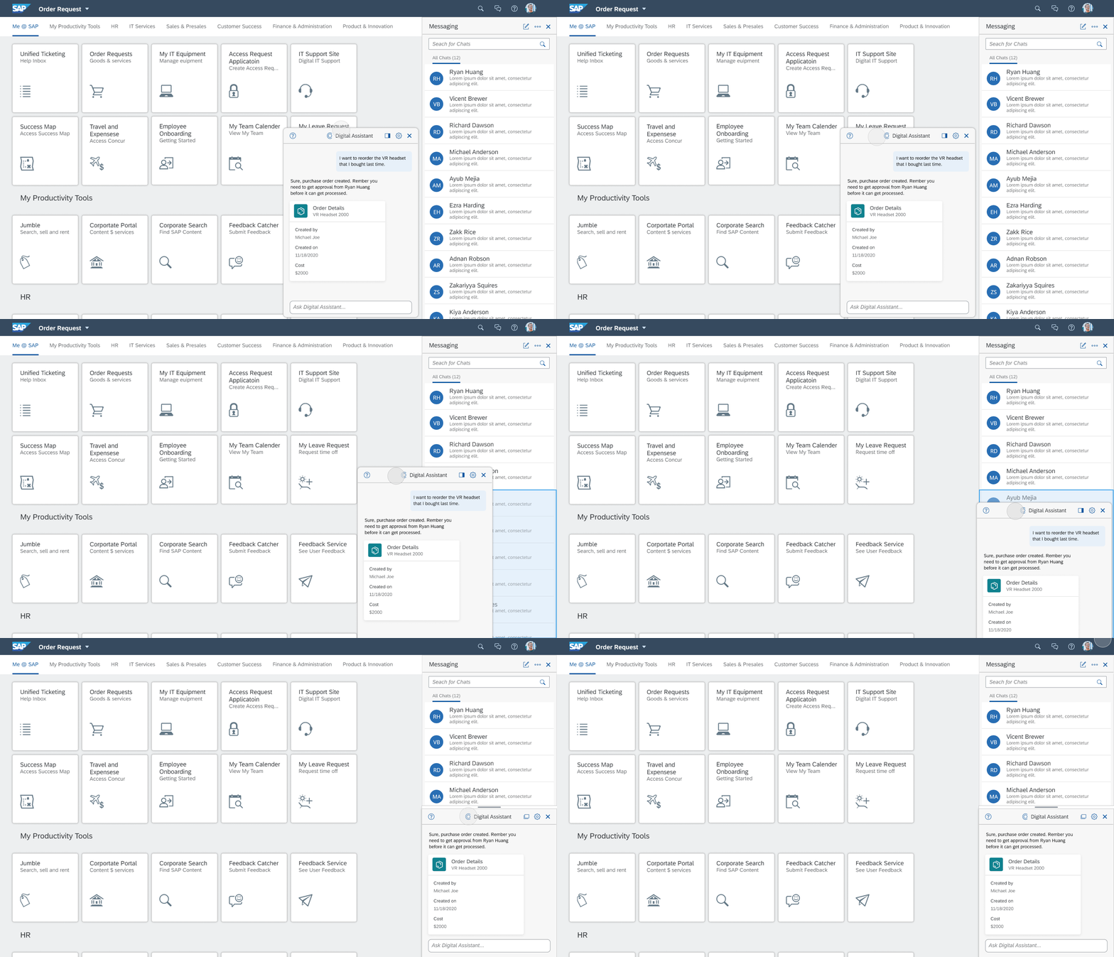
A redesign of the enterprise chat layout to allow both SAP’s digital assistant and Human-to-human chat to coexist inside SAP Fiori Launchpad while eliminating confusion identified in the current product.
Role
Lead Designer
Timeframe
3 months (Sep - Dec ‘29)

OVERVIEW
Solving a long-standing problem with extensive testing
There are two chat products that coexist on the SAP Fiori Launchpad: a Human-to-Human chat (H2H) for employees to communicate with each other, and an SAP Digital Assistant (DA) for users to ask questions or submit requests. Currently, DA and H2H chats are placed inside the same panel but under different tabs. Feedback showed that: users not only had difficulty switching between the two chats but also understanding the functionality of each.
Human-to-Human Chat
Digital Assistant
How should DA and H2H be placed on Fiori Launchpad so that they are easy to understand?
Note: For this project, we are only working with the placement and layout of each chat on the page. The functionalities and designs of the chats are out of scope.
After several rounds of explorations and user testings, the final design separates both the entry points and the panels for DA and H2H chat, while at the same time providing users an option to reorganize them to save the workspace.
Separate Entry Points
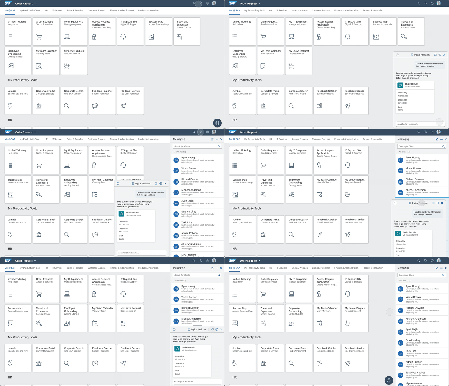
Users can access DA from the floating button on the bottom right of the page. Access to H2H, however, is placed on the shell bar to keep its distance and help users distinguish the two functions.
Panel - DA floating & H2H docked
On click, DA opens as a floating panel towards the bottom right of the page, while H2H opens as a docked panel to the right. Different visual treatments further separates the two chats from each other.
Stacked windows as a transient option
With full respect to the virtual environment that users are working with, there is often a lot of data already shown on the page. Therefore, we want to give users the option to stack the two chat panels as a transient state in case they want to save more screen space.
My role and responsibilities
I led the end-to-end design process from user research to design validation while collaborating with another designer. I was also responsible to communicate findings and final design proposal with a group of stakeholders through multiple presentations.
RESEARCH
Secondary research to understand industry standards
In order to get insights into the problem, the first thing we did is to research products with chat functions and see how they deal with their chat anchors and panels. The key takeaway is that most solutions are specifically tailored to each product and use case, so we should explore as many options as possible and validate them quickly to see what works the best in our favor.
Integrate chatbot alongside with other generic chat messages
After clicking each chat, a separate window opens and anchors on the bottom of the screen
Chat window can be minimized to save space
chat aligned at the bottom of the screen
max of 5 chats can be opened at the same time
InMail (paid service) is displayed differently: occupies significantly larger real estate & counts as two private chats.
Slack
Threads dock on the right-most column. Only one thread can be open at a time. If a second thread is engaged, displayed content will be replaced.
Right column is fully independent and adjustable. Yet content shown in the middle coloum depends on the left one
Adobe
Fully customizable layout with predefined layout also available
Can choose to stack panels on top of each other to form tabs (similar to browser tabs)
Panels can be docked next to each other or be floating on the page by itself
Maya
Fully customizable layout similar to Adobe
Tabs both sideways and horizontally to allow more complex interactions
More strict pairing of functionality and screen real estate (ex. perspective adjustment only in the center work area)
SAP CAI Builder
One is the child of the other
One can be triggered by the other
Side by side layout
Rapid bi-weekly design sprints and user testings
We decided to apply the Rapid Iterative Testing and Evaluation method as it is extremely effective for gathering actionable insights from target users and quickly providing design recommendations. With the structured bi-weekly user testing & iteration setup, we conducted 4 rounds of interviews with 21 unique participants on more than 20 design explorations during a period of 2 and a half months.
20+ Explorations
4 Rounds of User Testing
21 Unique Participants
In each round, we explored multiple design solutions and through structured interviews with at least 5 participants. Not only did we get ideas on how to improve the designs, but also we got inspirations to generate more variations. The next section will give a brief summary of what we explored in 4 rounds of design and testing.
Figma file for explorations
Interview sample notes
EXPLORATION
1. Single vs. Separated Entry Points
Based on competitive analysis, we’ve seen existing products adapting both approaches for DA and H2H: having each displayed separately or having both integrated into one window. As a result, we explored both single and separated entry points to access the features. Below is just two examples out of many explorations.
Separated points of entry
Single point of entry
2. Various Entry Point Types & Locations
We also explored different types and locations for the entry points as shown below. These different ideas came up from different rounds of explorations.
3. Different Docking & Floating Combinations
We also explored different docking & floating combinations for DA and H2H. For example, both floating, both docking, one docked and one floating, both tucked to the right, one tucked to the left and one to the right, etc. Below are several examples we explored and tested.
INSIGHTS
Research informed design decisions
1
Applying separate entry points for DA and H2H helps users to differentiate the two and diminishes confusion.
2
Floating button as an entry point for Digital Assistant is an established pattern that users are already familiar with
3
Users want a clear visual distinction between the two chat windows as they serve very different purposes. In addition, each window should open and close with its own launch button.
4
Placing the floating panel at the bottom right is another well-established pattern and thus seen as “out of the way“, whereas any other location on the screen is perceived as blocking the view
5
Stacked windows is not very well taken when tested as a default layout, but users like having this as a transient option because it allows them to save more screen space when needed.
DESIGN
Five states to cover all user needs
1. Initial state
The entry point for Human-to-human (H2H) is located on the shell bar with the chat icon, and the entry point for digital assistant (DA) is on the bottom right with a floating button. We give more emphasis to showcase the digital assistant by making it more prominent.
2. DA only state
With the floating button clicked, Digital Assistant will be launched as a floating panel on the bottom right of the screen.
3. DA & H2H coexist state
If the user needs to talk to both the DA and a colleague at the same time, he/she can click the Chat icon on the shell bar. Human-to-human chat will then come in as docked window to the right of the screen.
4. Transient state
The two windows can be docked together to create more workspace. When dragged, a highlighted area shows the target docking location. The window automatically docks in place on mouse release.
You can achieve the same thing using the dock/undock icon.
5. H2H only state
Lastly, if close out the digital assistant, this is what it looks with only the Chat window open.
VALIDATION
Double check against the status quo
Since the design will largely impact Fiori LaunchPad, we need to convince many stakeholders, including the Fiori central home team and the design council, that the new proposal is the most intuitive and worth implementing. In order to achieve that, we send out a survey with the following 3 of the design options to get feedback internally. The survey results came back supporting our design proposal as it is the most preferred option.
Option 1
Existing Fiori 3 pattern
Option 2
An exploration aligned with Fiori guideline
Option 3
Our design proposal
TAKEAWAY
Every design decision needs to be backed up by data
By the end of the process, we presented our proposal to different teams, stated the amount of research we did along the process, the design decisions made and reasons behind, and how the survey result proved that it’s a good solution compared to previous Fiori patterns. With both qualitative and quantitative data as backup, we got support from the design council and other teams.
Given the fact that most of the stakeholder does not directly participate in the actual design process, communication became the key. Through many rounds of presentations and Q&As along the way, I could not stress enough how important it is to make sure all design decisions are supported by testing data. The responses from the audiences were visibly different when research was thoroughly presented. It is so much easier to a compelling story with data and let the design speaks for itself.


